If you are like me and are the owner of a site on your company SharePoint intranet then you know the struggle: my SharePoint department site has to look great and the content needs to be discoverable. How can I create a perfect SharePoint intranet experience for my users?
However, because our intranet is built on SharePoint, attaining the structure and look for our site hasn’t always been easy. We’ve had to rely more on IT than we would like. As content owners, I want my team to be able to be agile and independent content creators and the results need to meet our standards. You have great information, but the user experience is less than ideal. No one wants that.
Luckily for us, modern SharePoint has really come far! What was previously difficult, is now so much easier for the average user (with the right permissions 😉). And with a little help from the BindTuning Intranet subscription, content creators, like myself, can create perfect intranet sites to suit our department needs.
5 ways to make your site great
In solidarity with other content creators like yourself, let me walk you through 5 things you can do to make your site look great.
1. Everything on the page is branded.
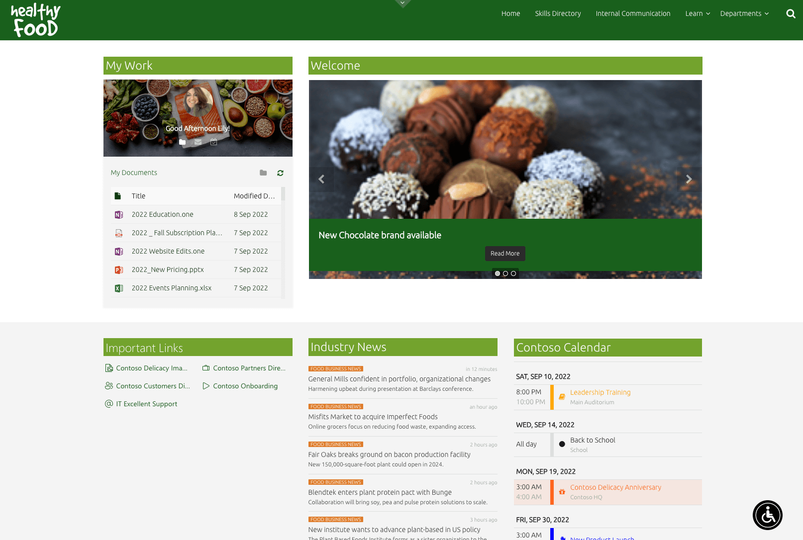
Such a simple detail but too often overlooked. Branding a site or page can take your content from meh to wow. Beyond just the header, each element on your page should use your brand fonts and feature your color palette. This is not an area where you give employees creative license (sorry). There is no excuse for every page on your company intranet not supporting the corporate brand. Especially now, with so many employees working remote, make sure your brand gets reinforced every time users log in.
In some cases, divisions have their own identity, under one corporate brand umbrella. One of our customers has successfully done that, making the most of BindTuning products. You can read their branding story read their branding story here.
“For us our brand internally is about our culture. What do we stand for as a business? How do we operate? How do we work together? How do we work as a team? How do we communicate as a family?”
Branding your intranet with a BindTuning theme couldn’t be easier. You simply grab the corporate palette from any URL that features your brand colors and it automatically grabs all the HEX codes for your site. It’s so easy, we call it the Magic Tool. And more than just colors, the fonts, navigation, header and footer areas are all customizable. Similarly, you can even extend branding to Microsoft Viva.
Once you have your branded theme for your site, the BindTuning web parts on each page inherit the colors and fonts set in the theme. Therefore, not only the page is branded, but each individual content area also adheres to the brand.
However, if you still need a little extra zing or even a temporary effect – CSS code panel inside BindTuning themes and the Script Editor web part offer you the opportunity to easily add CSS code to an entire site or just one page or content area. You can really go nuts within your page.
2. Give visibility to people
One of the very first things people see on our marketing department site is our team directory. This is our digital space, and we proudly own the content. So, it is important to make sure that anyone who lands on this page has a real person they can reach out to for questions or support.
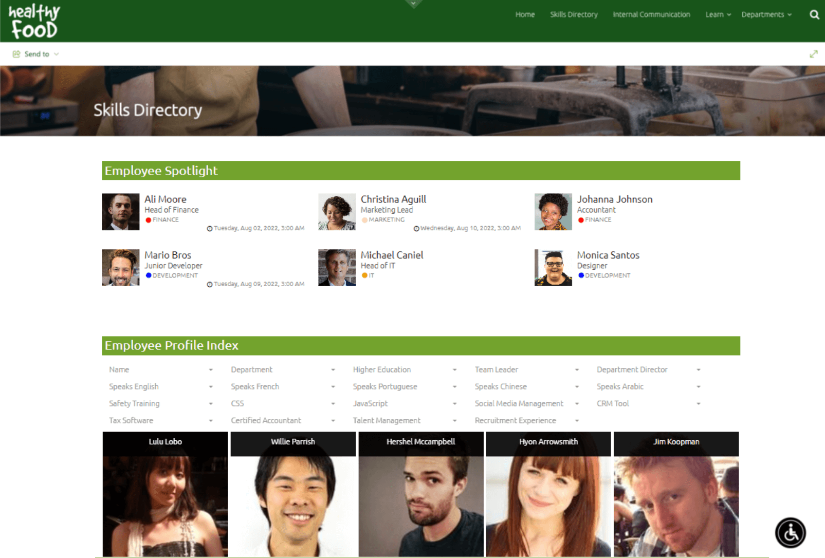
The News web part has many uses beyond just news. It gives you the ability to highlight your team with several layout options to fit the space you have on your page. Condensed, boxed style, basic cards, or gradient– there’s a style that will align with the other content on your page. Toggle between layouts until you find the right one.
The information displayed can be minimal or extensive. You can add any kind of information and even list SME information. With the Filters web part, people can find the right person to connect - indispensable for a larger or remote workforce.
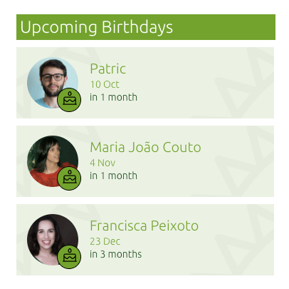
And while we are talking about remote users, let’s not forget the importance of recognizing people - their milestones, birthdays and achievements! On our intranet home page, we make sure to highlight our people using the Celebrations web part. It helps keep us connected and engaged for the events that matter in our lives.
3. Gather all content, in one place.
As a marketing organization, we have lots of internal documents, but we also have a ton of external content as well. Social media feeds, analytic data, images, news reports – all important content we need to share. Not only limited to SharePoint lists, modern BindTuning web parts are greatly improved - supporting data mashups and will soon support external data like One Drive, Google Drive files and more. Imagine an image gallery with images stored in different sources, consolidated into one view. Or create a frequently used links area with colorful icons to make it easy to jump to sites and content quickly. Display news and social posts in a feed on the page.
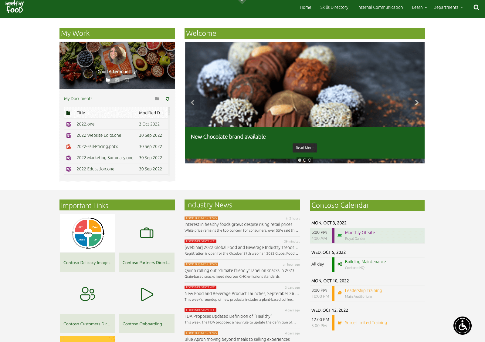
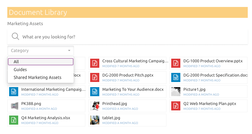
When it comes to finding the right document a SharePoint intranet doesn't automatically solve this problem. No department operates in a silo, yet if documents are not accessible then the corporate intranet certainly doesn't help with cross-department collaboration. With a better Document web part from BindTuning, users can source documents across ALL of SharePoint instead of just one site collection. Not a copy, but stored in its respective site collection and accessible for users from your site.
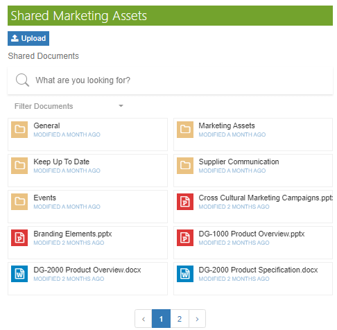
As is the case with SharePoint Lists and Quick Links, icons, tiles and a variety of other display options help users visually filter through content in meaningful ways.
4. Make information discoverable
Speaking of documents, we have so much content that sometimes it is hard to find the right information. Smart filtering and search capabilities within content areas helps users find exactly what they need. All BindTuning products feature a built-in CAML query editor, allowing content to easily be filtered for display. The interface is user-friendly and instantly predictable.
5. Keep it simple.
No one likes to go to a page that has endless text, endless content. There are so many options to simplify and illustrate content that not only saves page space but makes it way easier for visitors to consume the information you present. Here are a few examples of page elements you can use:
- Tiles – visually represent content with images or colored blocks. It breaks up large sections of content and makes content “clickable”
- Icons – such a simple way of differentiating content with an icon. You know they work, use them!
- Accordions - Maximize space on your page with expandable content areas
- Table of Contents - Easily recognizable, organized content with anchors.
- Dividers – The power of space on a page.
- Titles – give each content area a nice heading while you are at it.
- Pagination – Have a huge image gallery? Pagination keeps that content area under control!
- Content bookmarks and social engagement (coming soon!) – Allow your site visitors to bookmark important information and even share and like content!
All of these features can be found in our web parts gallery, included in every BindTuning Intranet subscription and can go a long way in making a perfect SharePoint intranet.
Get Started
A BindTuning Intranet Subscription gives you the functionality your content creators need while minimizing the burden on IT admins. Themes, web parts, accessibility and Microsoft Teams all bundled into one subscription that provides indispensable features for intranet pages and sites that are not available out of the box. If you want to take our products out for a spin, you can Start a free trial, or get a demo. We’ll re-create any scenario right with you. It’s the fastest way to envision your perfect SharePoint intranet.
